OSN Design System
OSN Design System
OSN Design System
Establishing an adaptable solution via a comprehensive design methodology
Establishing an adaptable solution via a comprehensive design methodology
Establishing an adaptable solution via a comprehensive design methodology
Utilizing my comprehension of individuals and design to aid teams in reducing complicated procedures and building extensible merchandise.
Utilizing my comprehension of individuals and design to aid teams in reducing complicated procedures and building extensible merchandise.
Utilizing my comprehension of individuals and design to aid teams in reducing complicated procedures and building extensible merchandise.
UI/UX
Stule Guide
Design System
Front-End Dev

ABOUT
DESIGN SYSTEM
ABOUT
DESIGN SYSTEM
A design system comprises of reusable elements, governed by comprehensive standards, allowing any number of applications to be constructed. This methodical approach to product creation and evolution includes guidelines, processes, components, and codes. It serves as the ultimate reference for teams, simplifying product design, development, testing, while maintaining uniformity across products, pages, and channels. Crafting a design system for a global corporation requires a thorough inventory of every component. It’s an enormous endeavor requiring both a holistic perspective and detailed concentration.
A design system comprises of reusable elements, governed by comprehensive standards, allowing any number of applications to be constructed. This methodical approach to product creation and evolution includes guidelines, processes, components, and codes. It serves as the ultimate reference for teams, simplifying product design, development, testing, while maintaining uniformity across products, pages, and channels. Crafting a design system for a global corporation requires a thorough inventory of every component. It’s an enormous endeavor requiring both a holistic perspective and detailed concentration.
The objective was to weave a harmonious aesthetic and experience across the company's diverse software offerings. Develop and uphold a unique design system, ensuring its accessibility to product owners, designers and developers within various teams.
The objective was to weave a harmonious aesthetic and experience across the company's diverse software offerings. Develop and uphold a unique design system, ensuring its accessibility to product owners, designers and developers within various teams.
TEAM
TEAM
We were a lean design system team of 6 at OSN! To rock our ever-growing library of components, we kept things transparent and documented everything meticulously. Openness was key!
We were a lean design system team of 6 at OSN! To rock our ever-growing library of components, we kept things transparent and documented everything meticulously. Openness was key!
DURATION
DURATION
3 Months
3 Months
OUR GOAL
OUR GOAL
Organize OSN groups by providing them a more systematic and directed approach to develop products.
Organize OSN groups by providing them a more systematic and directed approach to develop products.
Accelerate the design and creation cycle with a pre-built library and patterns, enabling the team to construct and examine layouts much more rapidly.
Accelerate the design and creation cycle with a pre-built library and patterns, enabling the team to construct and examine layouts much more rapidly.
Enhance business image and customer confidence via uniform experiences that cater to all, and enable users to achieve their objectives.
Enhance business image and customer confidence via uniform experiences that cater to all, and enable users to achieve their objectives.
Advocate for the inclusivity of our offerings by integrating accessibility features in both the design and codebase of our component libraries.
Advocate for the inclusivity of our offerings by integrating accessibility features in both the design and codebase of our component libraries.
Ensure uniformity in the aesthetic design of products and applications across platforms (Mobile, Web, Tab and TV)
Ensure uniformity in the aesthetic design of products and applications across platforms (Mobile, Web, Tab and TV)
To guarantee the triumph of this endeavour, securing stakeholder support prior to constructing our design infrastructure was key. We methodically advocated for the project through:
To guarantee the triumph of this endeavour, securing stakeholder support prior to constructing our design infrastructure was key. We methodically advocated for the project through:
Presentation
Presentation
An initial, organization-wide demonstration where we circulated the contemporary challenges and the projected advantages of the undertaking for the entirety of the business.
An initial, organization-wide demonstration where we circulated the contemporary challenges and the projected advantages of the undertaking for the entirety of the business.
Collaboration
Collaboration
Incorporating technical expertise at the onset via fortnightly design structure discussions and sessions for their contributions.
Incorporating technical expertise at the onset via fortnightly design structure discussions and sessions for their contributions.
Response & Enhancement
Response & Enhancement
Distributing team's continuous assignments and the project's planned schedule.
Distributing team's continuous assignments and the project's planned schedule.
Co-Ownership
Co-Ownership
By involving different groups from the beginning and throughout the project’s development, we aimed to foster a feeling of joint responsibility at every stage.
By involving different groups from the beginning and throughout the project’s development, we aimed to foster a feeling of joint responsibility at every stage.
PROCESS
PROCESS


APPROACH
APPROACH
Benchmarking Study
Benchmarking Study
Before setting the groundwork, we conducted an analysis of current Design Systems, understanding their construction and organization. We performed a comparative examination, gleaning valuable perspectives from Material Design, Carbon Design System (IBM), and Edison Design System (GE).
Before setting the groundwork, we conducted an analysis of current Design Systems, understanding their construction and organization. We performed a comparative examination, gleaning valuable perspectives from Material Design, Carbon Design System (IBM), and Edison Design System (GE).
Accessibility
Accessibility
From the outset, we prioritized making our design system accessible. We respected the guidelines of the operating system and ensured each component adhered to high standards (native typographies, color contrasts, and touch targets).
From the outset, we prioritized making our design system accessible. We respected the guidelines of the operating system and ensured each component adhered to high standards (native typographies, color contrasts, and touch targets).
CONTENT STRATEGY
CONTENT STRATEGY
Superior design systems are more than just technical handbooks or fashion directives - they must demonstrate the toolkit and clarify why one component should be preferred over the other. We put substantial resources into outlining the tenets of our design setup and crafting accessibility guidelines that were ingrained right from the beginning.
Superior design systems are more than just technical handbooks or fashion directives - they must demonstrate the toolkit and clarify why one component should be preferred over the other. We put substantial resources into outlining the tenets of our design setup and crafting accessibility guidelines that were ingrained right from the beginning.
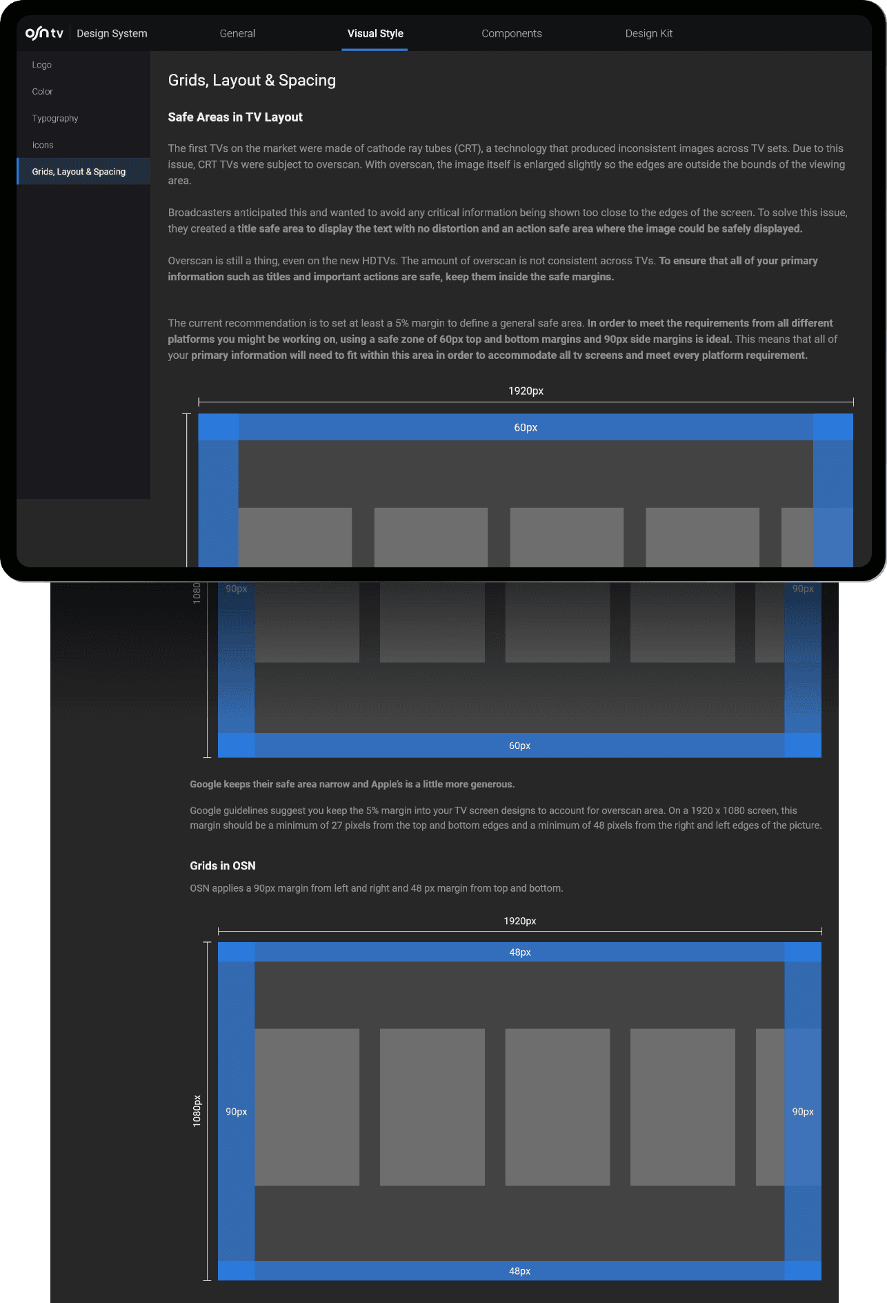
LAYOUT & GRIDS
LAYOUT & GRIDS
LAYOUT & GRIDS
Uniform components and margins in OSN Design layouts promote consistency throughout platforms, contexts, and adaptable screen dimensions.
Uniform components and margins in OSN Design layouts promote consistency throughout platforms, contexts, and adaptable screen dimensions.
Predictable
Utilize clear and expected designs, maintaining uniform interface sections and spatial arrangement.
Utilize clear and expected designs, maintaining uniform interface sections and spatial arrangement.
Consistent
Designs should uniformly apply grids, keylines, and padding.
Designs should uniformly apply grids, keylines, and padding.
Responsive
Designs are responsive. They adjust to the interactions from users, gadgets, and display components.
Designs are responsive. They adjust to the interactions from users, gadgets, and display components.
Layout zones form the bedrock of interactive encounters. They represent the fundamental units of a layout and are made up of elements and parts that perform similar roles. In addition, layout zones can accumulate smaller holders like cards.
Layout zones form the bedrock of interactive encounters. They represent the fundamental units of a layout and are made up of elements and parts that perform similar roles. In addition, layout zones can accumulate smaller holders like cards.
Three primary areas constitute a broad display layout:
App bars | Navigation | Body
When developing a flexible layout structure, it's beneficial to set lower and upper limits for the body and margins, with a scaling function that lets each section conform to diverse form factors.
Three primary areas constitute a broad display layout:
App bars | Navigation | Body
When developing a flexible layout structure, it's beneficial to set lower and upper limits for the body and margins, with a scaling function that lets each section conform to diverse form factors.
Body Region
Body Region
The main area of an application is where most of its contents are presented. This typically includes elements like lists, cards, buttons, and graphics.
This core area relies on scaling sizes for three critical attributes:
Vertical and horizontal dimensions | Number of columns | Margins. F
or smallest breakpoints, the margins get a value of 16dp. With a layout size increase, the main section extends according to the screen's width.
Once the first breakpoint is hit (small; 600dp wide), the margin grows to 32dp. At the body width of 840dp, margins boost to a maximum capacity of 200dp. Once this cap is reached, the core area regains its responsiveness, carrying on its horizontal scaling.

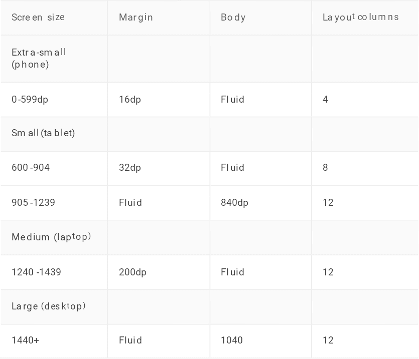
RESPONSIVE COLUMN GRIDS
RESPONSIVE COLUMN GRIDS
RESPONSIVE COLUMN GRIDS
The adaptive column grid system consists of columns, gutters, and margins, offering a reliable formation for element arrangement within the body section. Components, visuals, and wordings align with the columnar grid to guarantee a rational and uniform layout across various screen sizes and perspectives. With the expansion or contraction of the body section, the grid column number adjusts accordingly.
The adaptive column grid system consists of columns, gutters, and margins, offering a reliable formation for element arrangement within the body section. Components, visuals, and wordings align with the columnar grid to guarantee a rational and uniform layout across various screen sizes and perspectives. With the expansion or contraction of the body section, the grid column number adjusts accordingly.
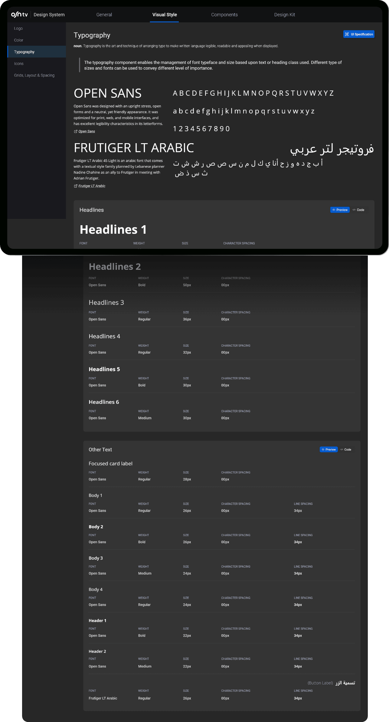
TYPOGRAPHY
TYPOGRAPHY
For our design system, we opted for a sleek and adaptable typeface. Our choice fell on Open Sans and Frutiger LT Arabic due to the ideal geometric form and inter-character spacing. This adaptable typeface boasts various weight variations, making it suitable for both headers and body copy. We also considered the right-to-left alignment typical of Arabic script and layout.
For our design system, we opted for a sleek and adaptable typeface. Our choice fell on Open Sans and Frutiger LT Arabic due to the ideal geometric form and inter-character spacing. This adaptable typeface boasts various weight variations, making it suitable for both headers and body copy. We also considered the right-to-left alignment typical of Arabic script and layout.
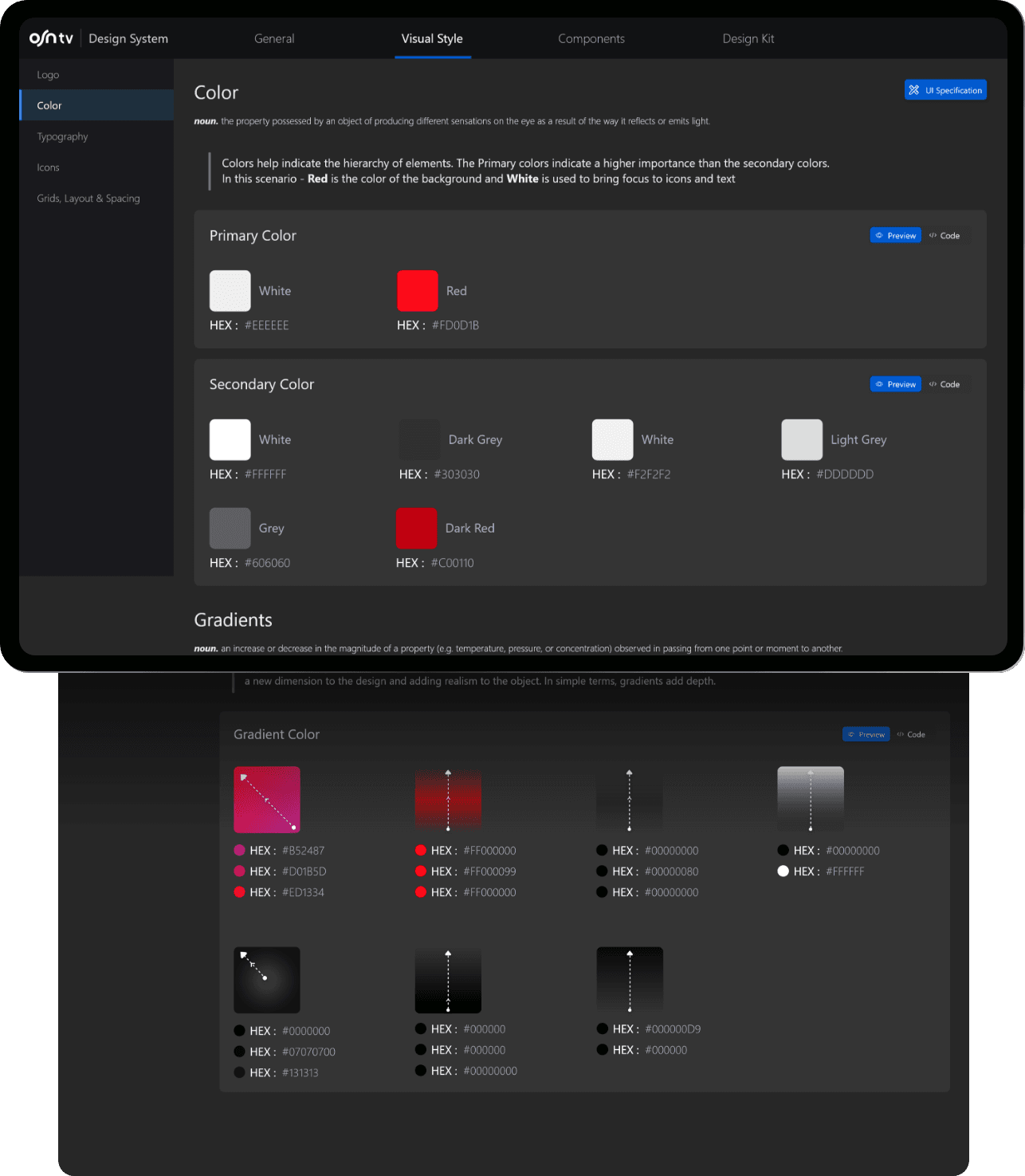
COLOR PALETTE & GRADIENTS
COLOR PALETTE & GRADIENTS
COLOR PALETTE & GRADIENTS
Color palettes are designed to preserve balance, ensure readable script, and distinguish between user interface elements and systems.
This includes colour spectrum for:
- Primary and secondary shades
- Variations of dominant and subordinate shades
- Additional user interface colours for backdrops, gradients, bases, complications, fonts, and icons.
Legible
Legible
Essential components, such as typography and symbols, must comply with readability norms when displayed on a monitor
Essential components, such as typography and symbols, must comply with readability norms when displayed on a monitor
Hierarchical
Hierarchical
Highlighting interactive components, defining their relationship with other elements, and denoting their degree of importance. Key elements should be the most noticeable.
Highlighting interactive components, defining their relationship with other elements, and denoting their degree of importance. Key elements should be the most noticeable.
Expressive
Expressive
Display brand hues during significant instances that cement your brand’s aesthetic and communication.
Display brand hues during significant instances that cement your brand’s aesthetic and communication.
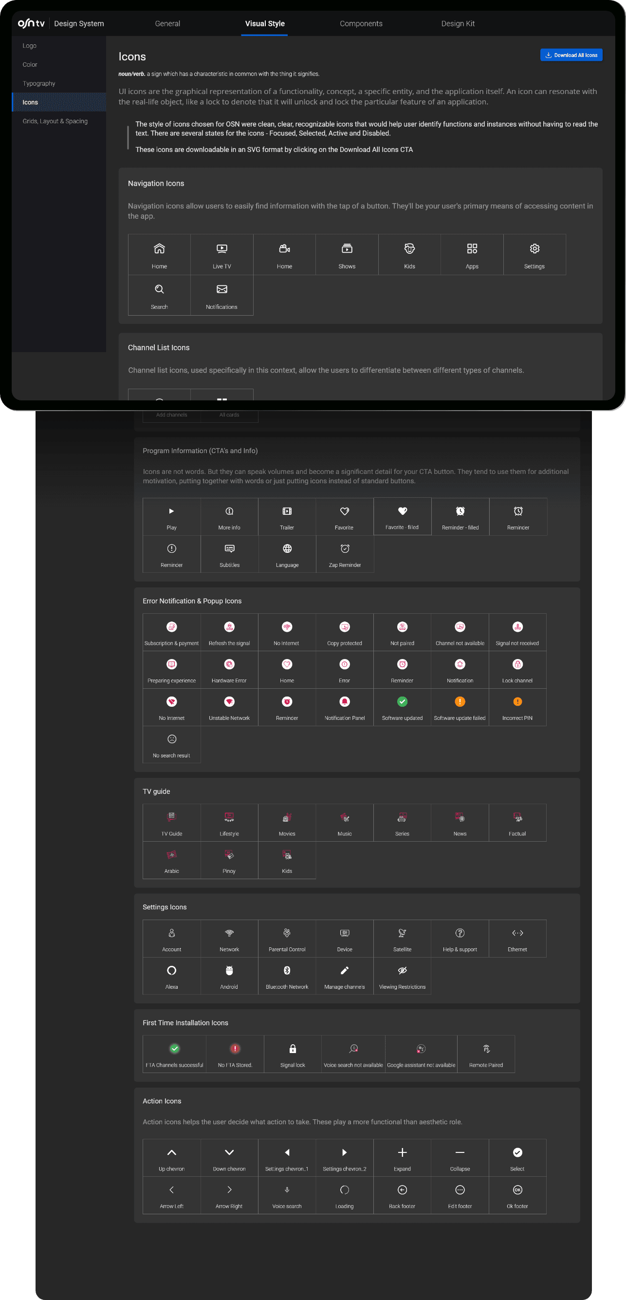
ICONOGRAPHY
ICONOGRAPHY
System icons are designed to be simple, modern, friendly, sometimes quirky, and designed to express essential characteristics in a minimal way. Each icon is reduced to its simplest form, expressing essential characteristics. The shapes of the icons are bold and geometric. Even at small sizes, they maintain a symmetrical and consistent appearance, ensuring readability and clarity.
System icons are designed to be simple, modern, friendly, sometimes quirky, and designed to express essential characteristics in a minimal way. Each icon is reduced to its simplest form, expressing essential characteristics. The shapes of the icons are bold and geometric. Even at small sizes, they maintain a symmetrical and consistent appearance, ensuring readability and clarity.
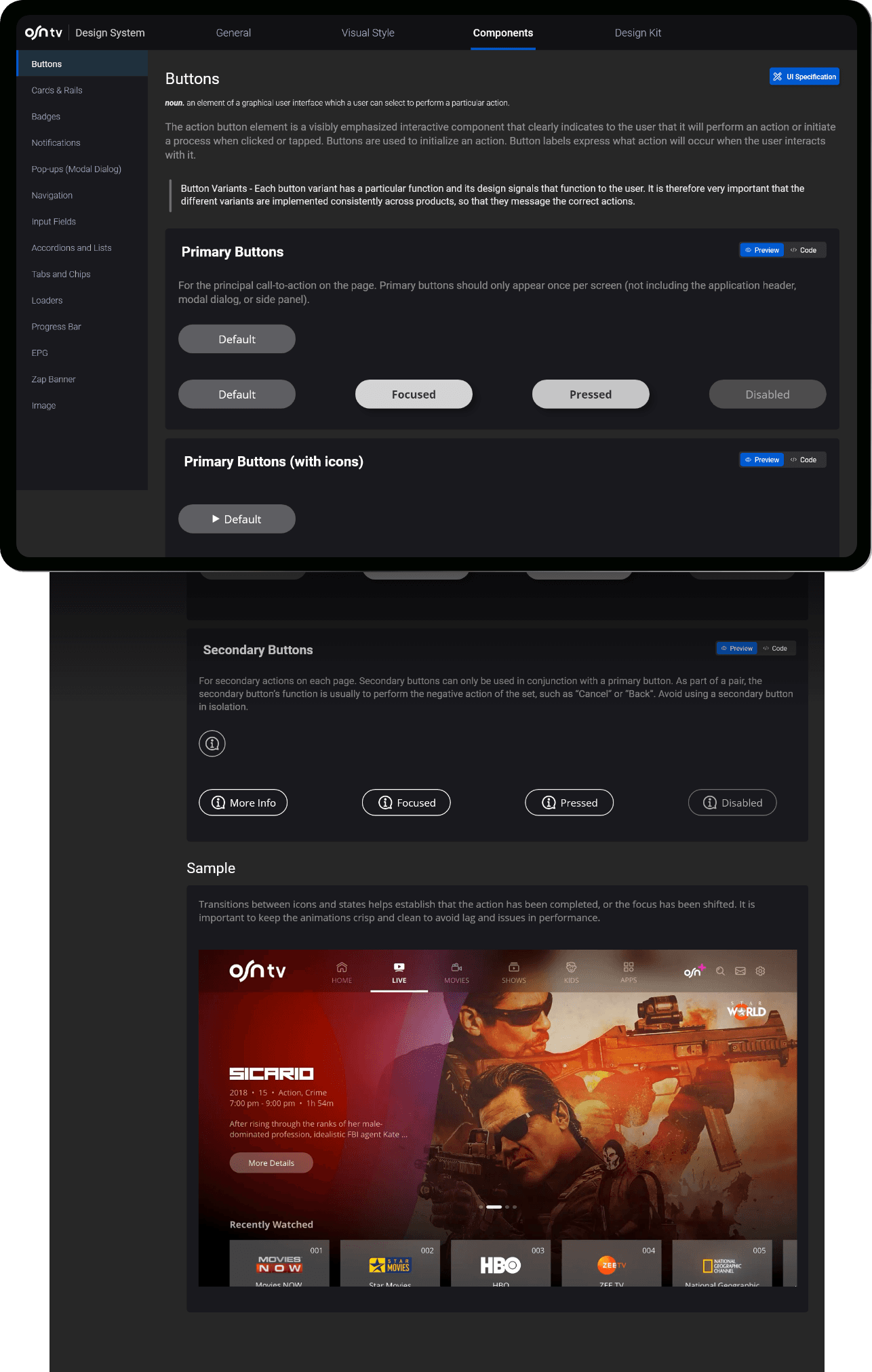
COMPONENTS
COMPONENTS
Elements are essential constituents of the design architecture. Their regularized application fosters both visual and functional uniformity throughout various products. Each element is specifically engineered and programmed to tackle a distinct UI challenge, like displaying a selection of choices, facilitating a form's submission, offering user feedback, amongst others. Thus, every element within this design system is crafted to operate in synergy, as individual components of a broader entity.
Elements are essential constituents of the design architecture. Their regularized application fosters both visual and functional uniformity throughout various products. Each element is specifically engineered and programmed to tackle a distinct UI challenge, like displaying a selection of choices, facilitating a form's submission, offering user feedback, amongst others. Thus, every element within this design system is crafted to operate in synergy, as individual components of a broader entity.
DESIGN SYSTEM
DESIGN SYSTEM
Results
Results