OTT Streaming App For 22M+ Users
Across Africa
Redesigning the Smart TV app for millions of African households to make content discovery, live sports, and on-demand streaming more intuitive, accessible, and engaging.
Project Overview
DStv Stream, MultiChoice’s flagship streaming platform, was undergoing a major product refresh. The TV experience was redesigned in parallel with the mobile and web platforms to ensure performance improvements and a consistent visual language across all devices.
I was part of the core UX/UI team tasked with reimagining the TV interface a 10-foot experience that would bring consistency across devices while delivering an intuitive and content-first design for a lean-back, remote-controlled environment.
6 Months
Timeline
UI/UX
Designer
My Role
Tool
Figma,FigJam
Key Challenges
Remote-First Navigation
/01
Limited interaction model (Directional pad, OK, back).
Avoiding deep hierarchies and reducing number of clicks.
Clear focus states (Highlight) to show where the user is.
Brand Alignment vs Modern OTT Standards
/02
Keeping consistent with DStv’s identity while competing with Netflix, Disney+, Showmax.
Modernizing visuals without alienating existing subscribers.
Accessibility & Diverse User Base
/03
Serving both tech-savvy youth and older, traditional TV users.
Ensuring readable typography, high-contrast themes, and intuitive flows.
Legacy User Behavior
/04
Many users are used to linear TV (channel zapping).
Shifting them to on-demand streaming without friction.
Goals
Unify visual identity across platforms
Improve content discoverability and drive engagement
Integrate advanced features: Cloud PVR, Watch from Start, personalized carousels
Build for accessibility, performance, and family-friendliness

Impact
Bringing clarity and consistency to the DStv experience.
Active User
+132% increase in active user after relaunch
Revenue
+71% YoY revenue growth
Market Growth
16% market penetration in SA (ahead of Netflix & Showmax)
Rating
⭐ 4.6 / 5 rating on App Store
Design Process
/01 Discovery & Research
Stakeholder alignment → define viewing goals: engagement, retention, ad revenue
User personas → Family users, Older non-tech viewers, Binge-watchers
Competitive analysis → Netflix, Apple TV, Disney+, YouTube TV
/02 Structure & Flow
Information architecture optimized for OTT (content-first navigation)
Simplified categories → Live TV, Movies, Series, Sports, Kids
User flows for remote-based navigation (browse → play → resume → discover new)
Wireframes considering focus states & horizontal/vertical rails
/03 Visual Design
Unified TV-first design system → dark backgrounds, large typography, high contrast
Responsive layouts for different TV resolutions
Focus indicators & motion states for remote navigation
Prototyping transitions → playback, profile switching, carousel navigation
/04 Test & Iterate
Remote-based usability testing (navigation speed, ease of discovery)
Focus indicators & motion states for remote navigation
Prototyping transitions → playback, profile switching, carousel navigation
/05 Handoff & Implementation
Dev handoff → UI specs, design tokens, focus/motion states
Multi-device QA (different TV models, remotes, resolutions)
Continuous updates → based on analytics + viewer feedback
User Personas
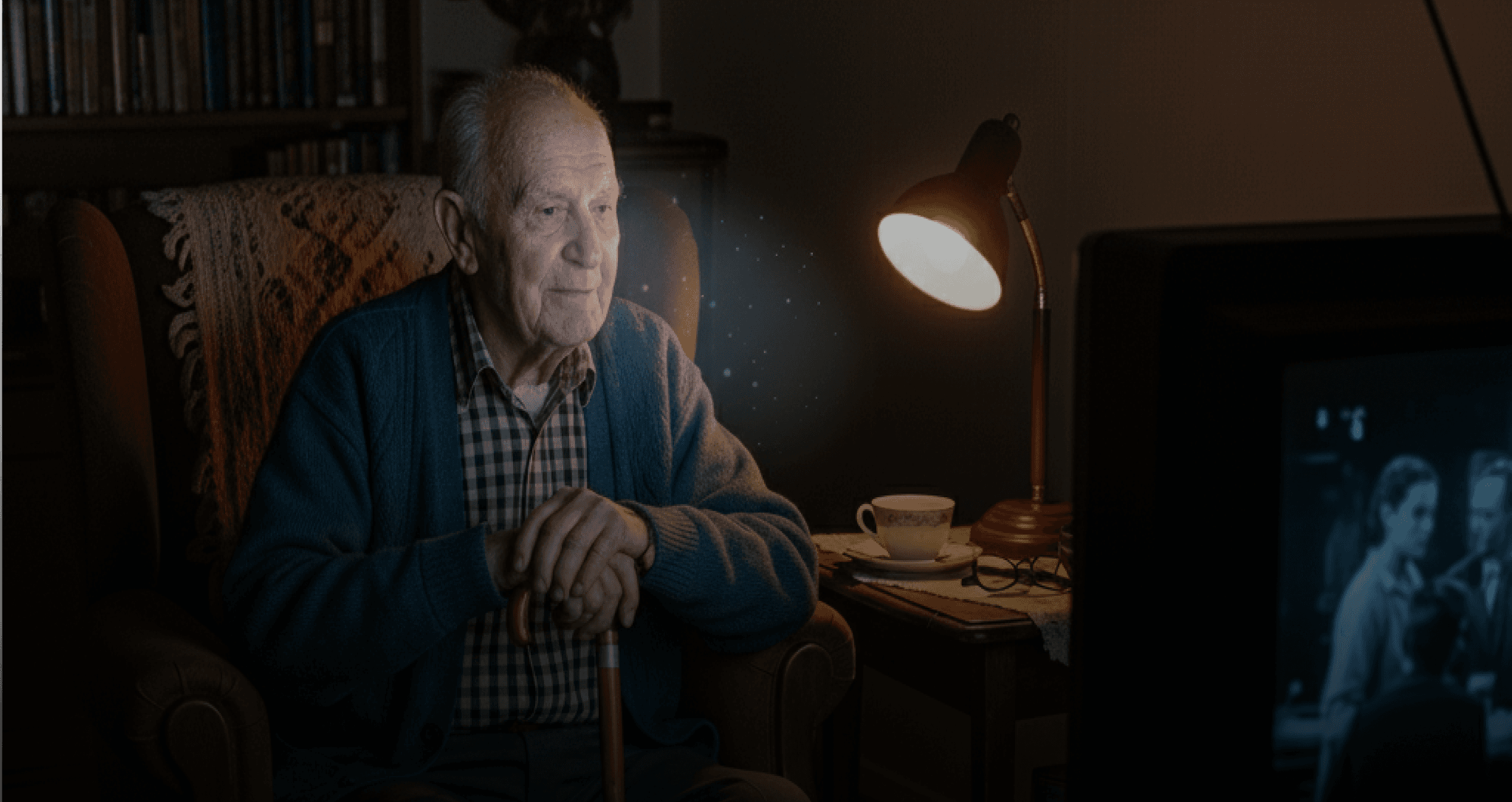
Peter Dlamini (The Casual/Older Viewer)
Peter enjoys watching classic drama series, family shows, and weekend movies. He prefers simple viewing experiences with minimal effort, relying mainly on his TV remote.
Age: 62
Location: Johannesburg, South Africa
Occupation: Retired school principal
Tech Comfort: Low
Goals:
Access favorite channels and shows quickly
Relax and watch without struggling with navigation
Simple, clear menus that don’t overwhelm him
Frustrations:
Small text that’s difficult to read from the couch
Overly complex menus with too many steps
Confusing layouts that make him lose track of what he was watching
Age: 29
Location: Lagos, Nigeria
Occupation: Digital marketer
Tech Comfort: High
Goals:
Seamlessly discover new content with personalized suggestions
Sync across devices (start on phone, continue on TV)
Quickly find trending and recommended shows without browsing endlessly
Frustrations:
Generic recommendations that don’t reflect her interests
Too many steps to switch between categories
Cluttered layouts compared to global OTT standards
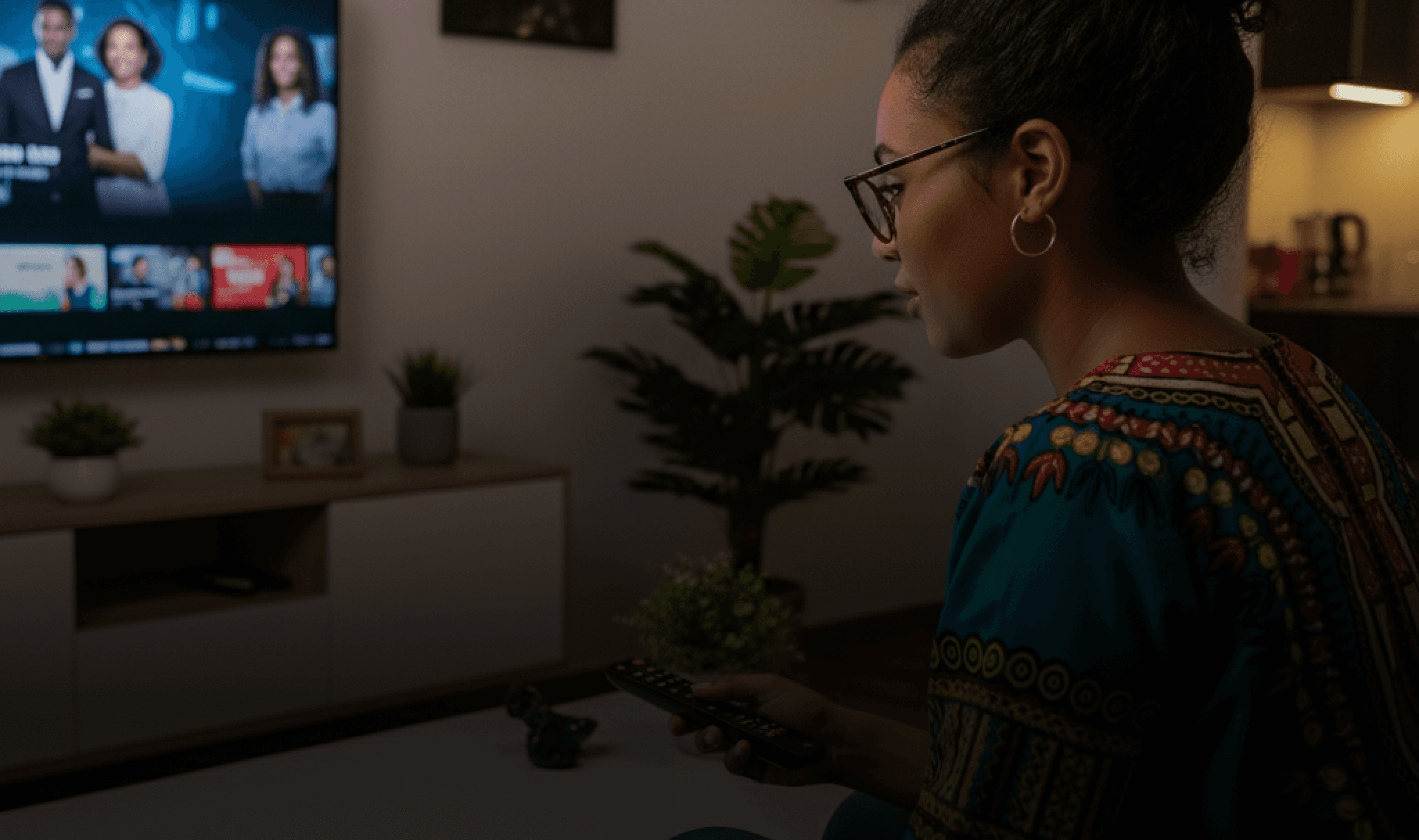
Aisha Khan (The Tech-Savvy OTT Binger)
Aisha owns multiple devices Smart TV, tablet, and smartphone. She streams across Netflix, YouTube, and Spotify daily. She loves binge watching international dramas, documentaries, and trending shows.
Recommendations
Expose contextual quick actions on TV focus — “Watch from Start”, “Record”, “Add to My List” on focused tiles to reduce presses and increase feature adoption.
Device pairing for sign-in & cross-device handoff — Offer QR/phone pairing to avoid TV keyboard friction, surface “continue on TV” from mobile.
Voice & predictive search roll out — Reduce search keystrokes, increase discovery, optimize for local languages.
Design system ops — Ensure tokenized assets, prioritize consistent focus states across TV.
UX Audit Insights (Heuristic Summery)
Key Usability Gaps
Navigation pain → Deep rails, slow remote navigation, no quick shortcuts.
Poor discoverability → Weak personalization & limited universal search.
Readability issues → Fonts too small, low contrast, cluttered screens.
Inconsistent design → Focus states & button hierarchy not standardized.
Terminology mismatch → Labels like “Catch Up” unclear for global users.
No onboarding/help → First-time users left unguided, support buried.
Priority Fixes
Simplify IA → fewer rails, clear categories
Standardize focus & remote patterns (10ft-first)
Enhance discoverability → search + recommendations
Improve legibility (larger fonts, high contrast)
Human-readable error messages with recovery flows
Add onboarding + contextual tips
Impact on users
Longer “time-to-content”
High frustration for older & casual viewers
Weak differentiation vs Netflix / YouTube / Prime
Feature parity grid (TV/OTT focus)
(✓ = native/full support, ◐ = limited/region or platform dependent, ✗ = not supported)
Competitive Analysis
Feature
DStv Stream
Netflix
Prime Video
Disney+
Hotstar
YouTube
Showmax
Apple TV+
Live TV / EPG
✓
✗
◐
◐(region)
✓
◐
✗
Linear channels (local & int’l)
✓
✗
◐
◐(region)
◐ (creator/live)
◐
✗
VOD catalogue (size / diversity)
◐ (large
regional +
licensed)
✓ (very large)
✓ (large +
channels)
◐(region)
◐ (user & VOD)
◐ (regional
+licensed)
◐ (smaller
original-focused)
Multi profile support
✓
✓
✓
✓
✓
✓
✓
Personalized
recommendations
✓
✓
✓
✓
✓
◐
✓
Original / exclusive content
◐
✓
✓
◐
◐
◐
✓
Search (universal / voice)
◐ (platform-dependent)
✓
✓
✓
✓
◐
✓
Downloads for offline
◐ (mobile)
✓
✓
✓
◐ (mobile)
✓
✓
Content discovery (browse, editorial)
◐
✓
✓
✓
◐
◐
✓
Multi device support (TV, web, tab, mobile)
✓
✓
✓
✓
✓
✓
✓
Social / watch party features
◐
◐
◐
◐
✓ (shared live / premieres)
◐
◐
Regional content & localisation
✓ (strong regional focus)
◐
◐
✓ (region)
◐
✓ (Africa focus)
◐
Visual Style
Design System
DStv Stream's TV interface needed a scalable, accessible, and remote-first design language. The existing UI was fragmented, and engineering efforts were duplicated across platforms. We created a dedicated design system to:
Align TV experience with mobile/web platforms
Speed up design and development cycles
Ensure remote-optimised interactions
Maintain consistency across resolutions, brands, anf content layouts
What Made It Unique?
Navigation
/01
Remote based navigation instead of touch or mouse.
Focus states instead of hover.
Responsive and Scalable
/02
10 feet readability- larger typography, spacing, contrast.
TV safe zones (to avoid UI Clipping)
Performance
/03
Performance improvement on low spec set-top boxes


205

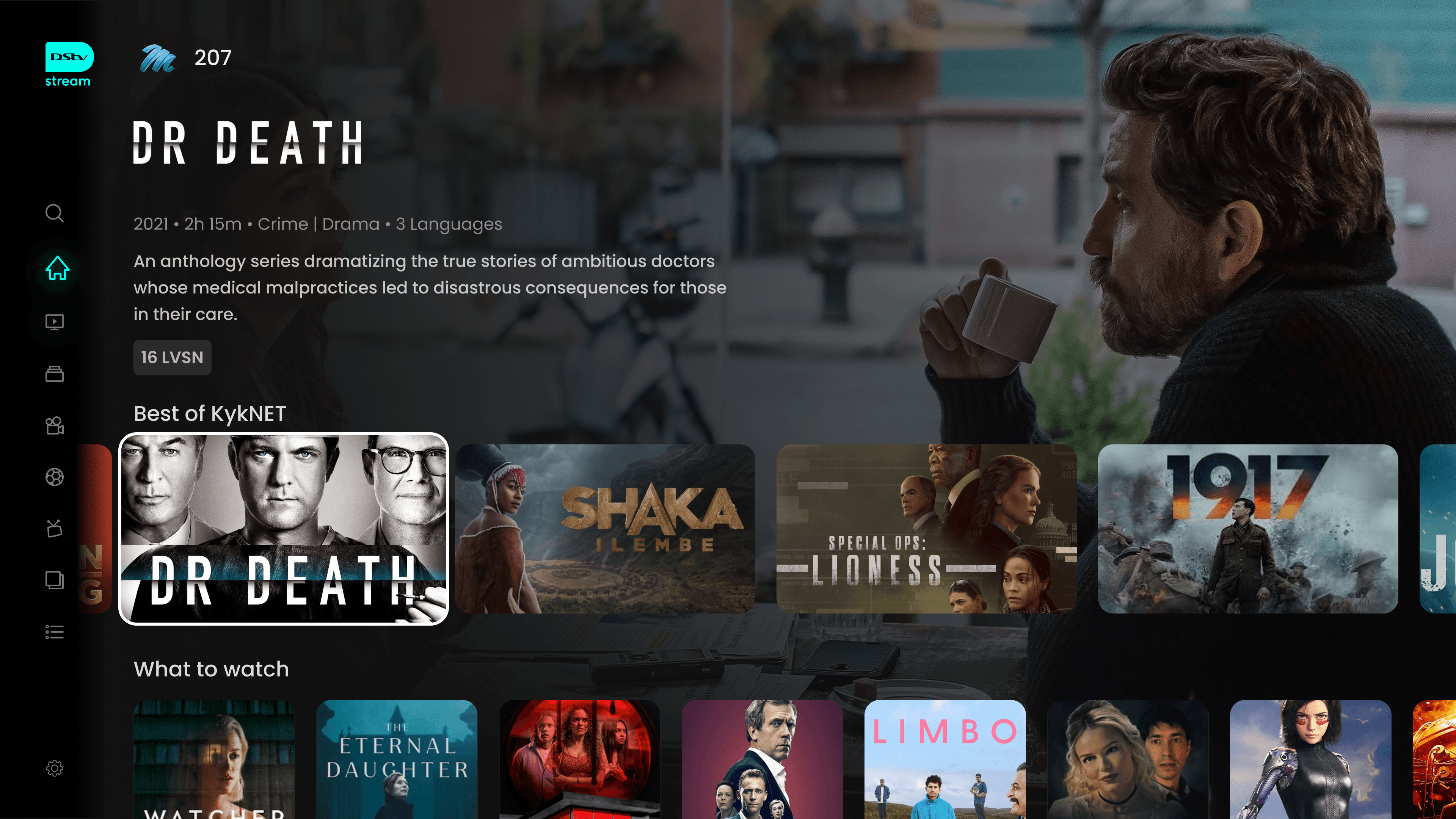
2022 • 2h • Adventure | Mystery • 3 Languages
As a serial killer stalks the city, a young actress who just moved to town with her boyfriend notices a mysterious stranger watching her from across the street.
16 LVSN

Typography & Colors
Aa
POPPINS
/FONT:
Bold
ExtraBold
Regular
Medium
SemiBold
0123456789!@#$%^&*()_+
Aa Bb Cc Dd Ee Ff Gg Hh Ii
Kk Ll Mn Nn Oo Pp Qq Rr
Ss Tt Vv Xx Yy Zz
#00FFEB
#1923BD
#FDFDFD
#02020D
Iconography


UI Elements
Button Label
Button Label
Button Label
Button Label
Removed from Continue Watching
Live

20m left
The Big Bang Theory
S1 Ep4
1h 40m left
The Big Bang Theory
S1 Ep4
16 LVSN
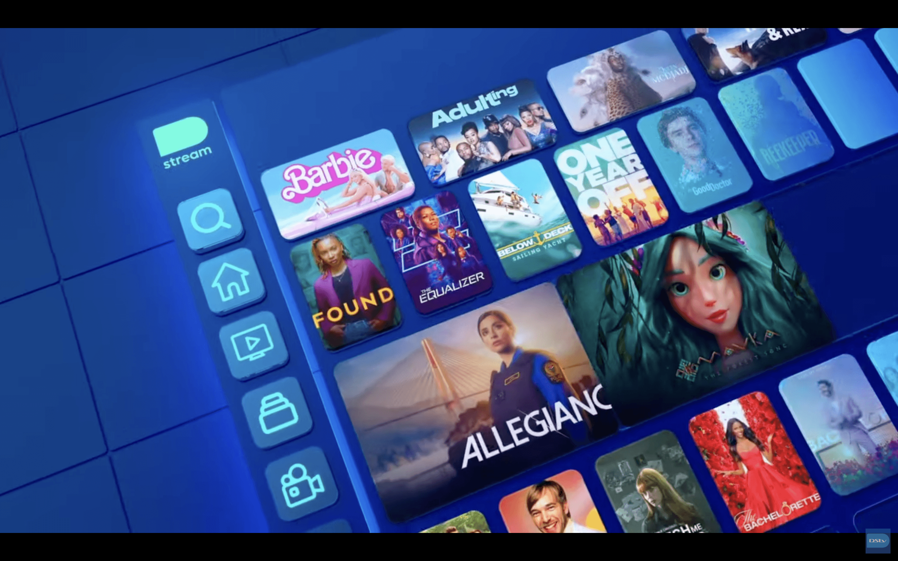
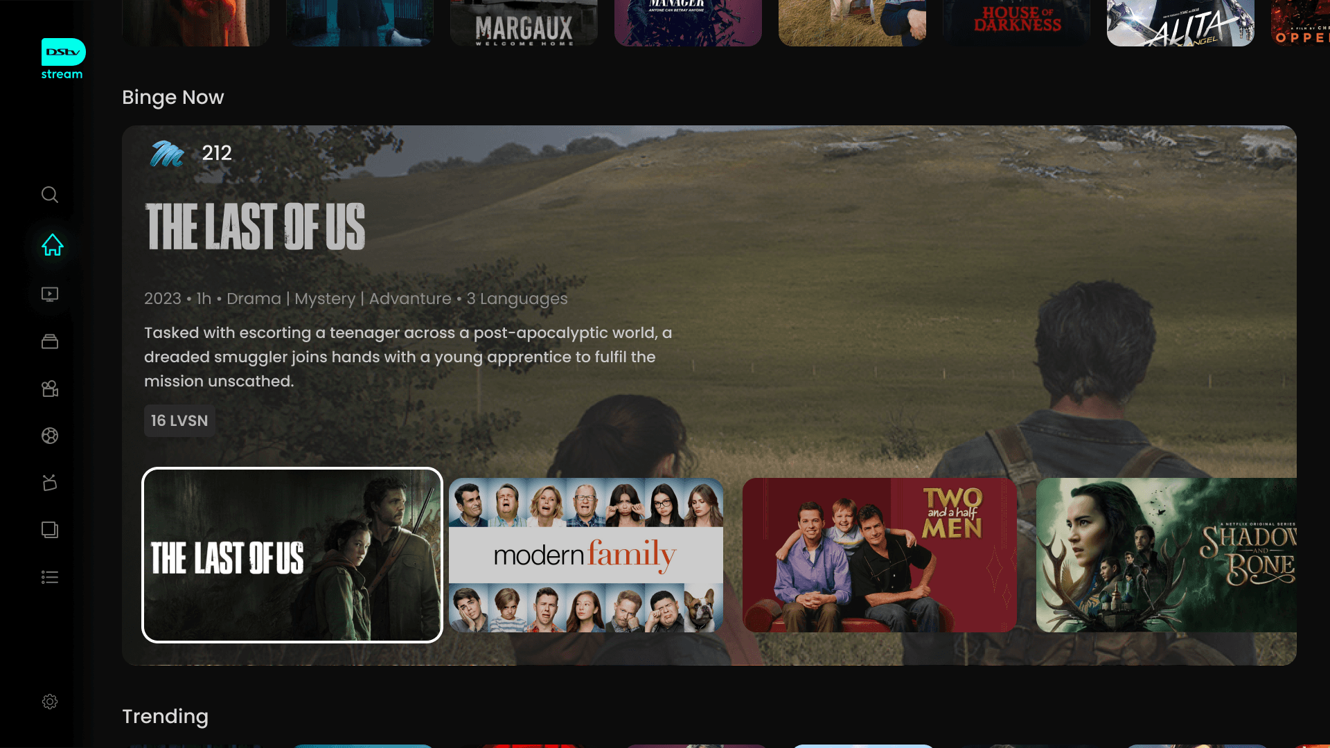
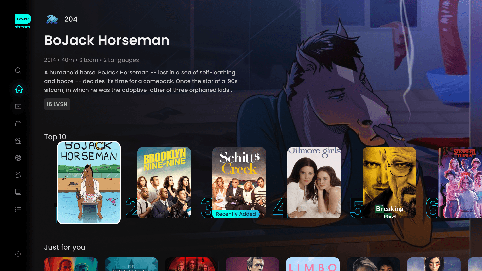
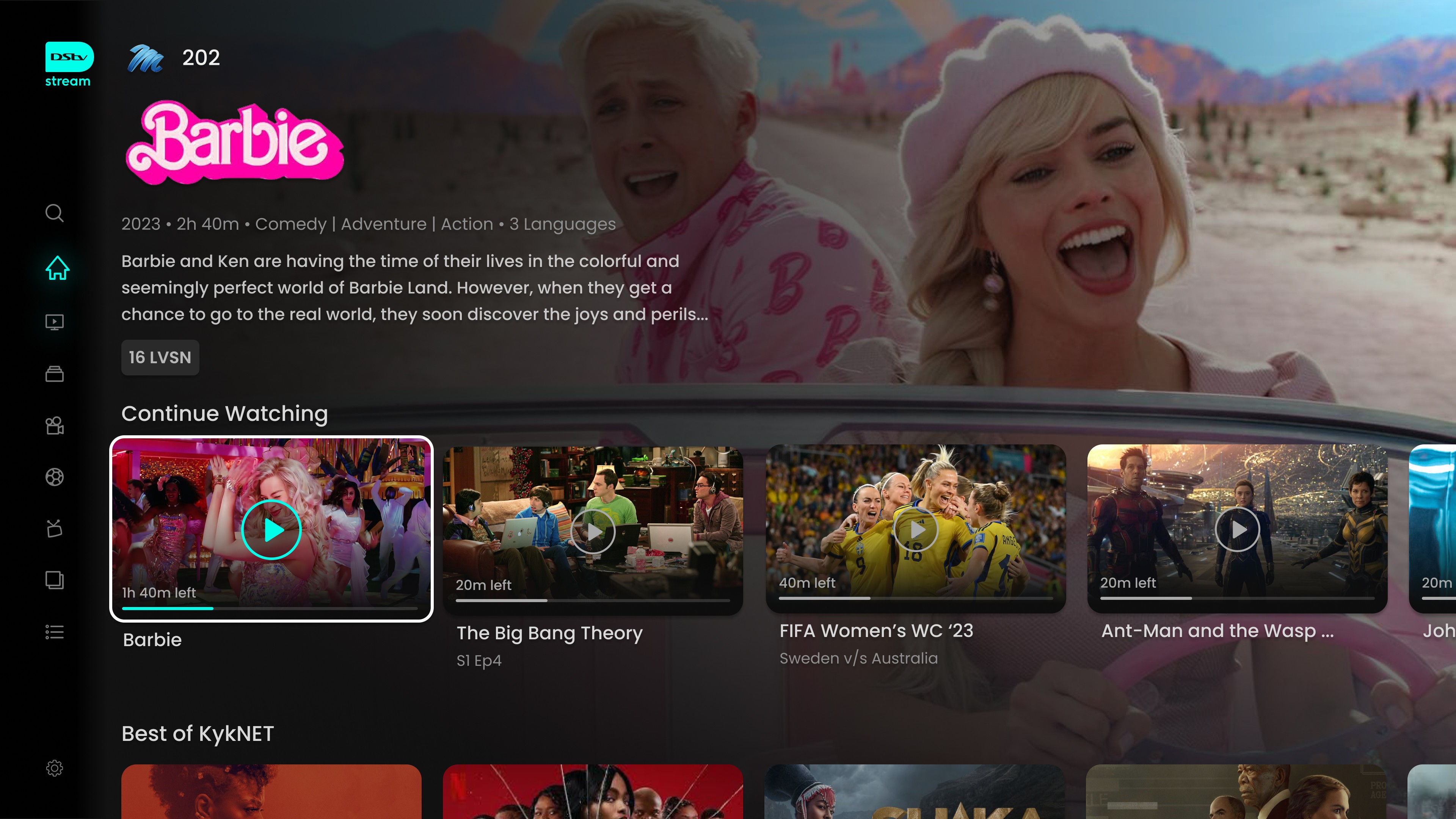
Introducing the all new Stream
DStv like never before
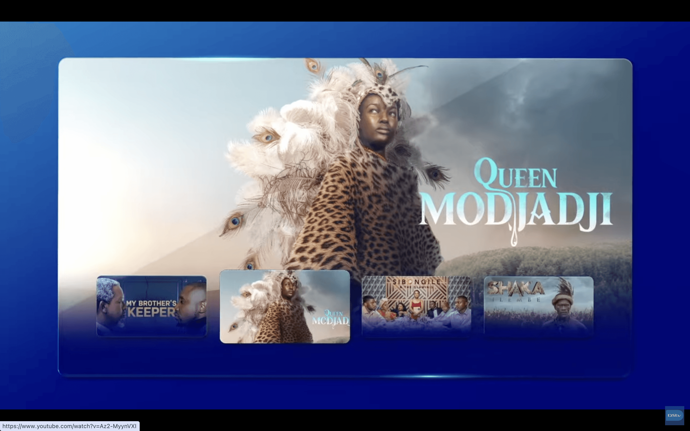
Dynamic Home
Modular layout highlights trending and premium content.
Social proof via Top 10 drives engagement.
Localized editorial sections add cultural relevance.
Personalisation & Recommendations
“Just for You” + “Channels for You” sections.
Reduces decision fatigue.
Builds stronger habit loops and retention.
Continue Watching
Consistent across Live TV, Movies, and Series.
Seamless resume experience across devices.
Reduces drop-off and drives repeat usage.
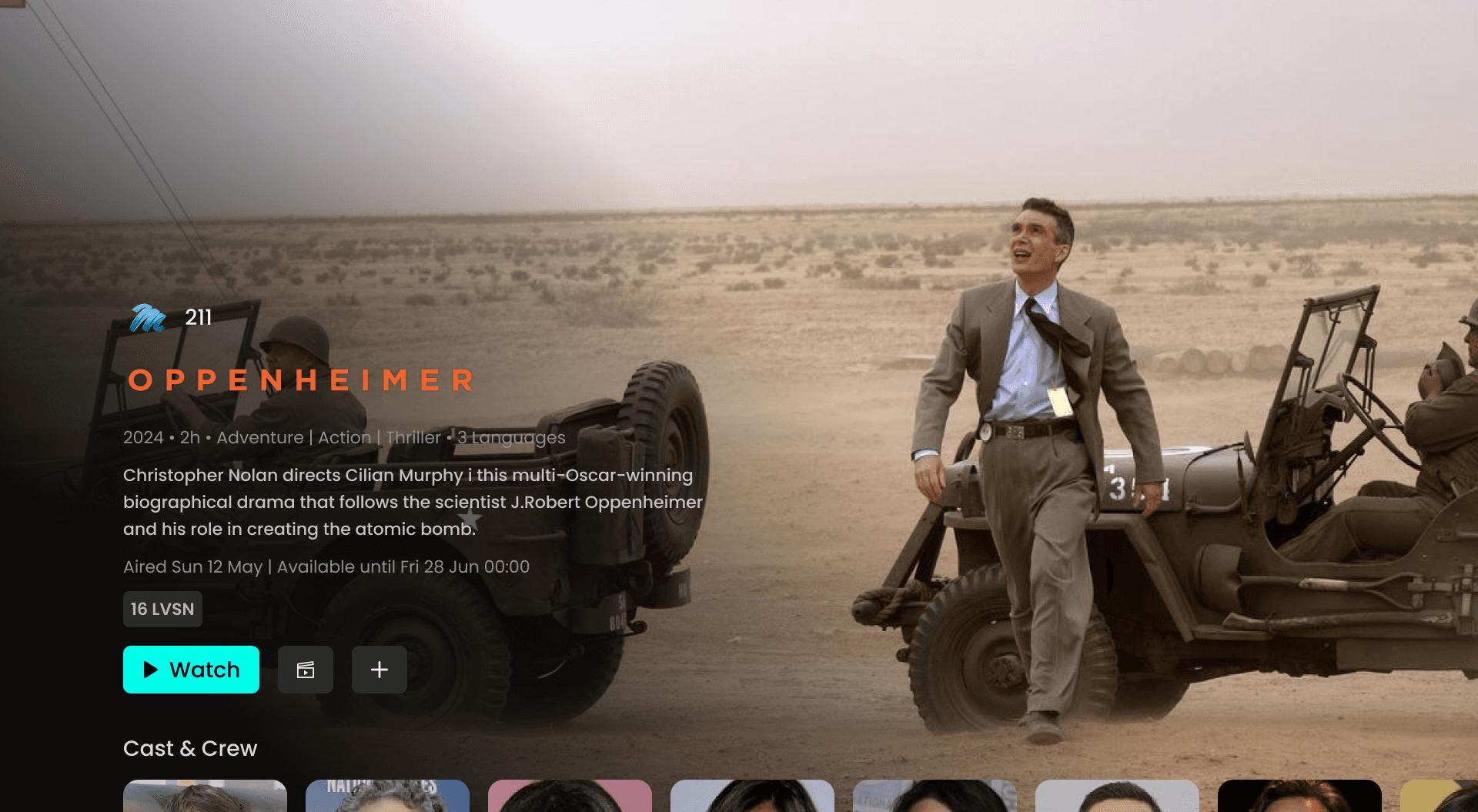
Trailers & Previews
Available on show/movie pages for quick sampling.
Lowers decision barrier before committing to watch.
Increases time-on-platform with exploratory browsing.
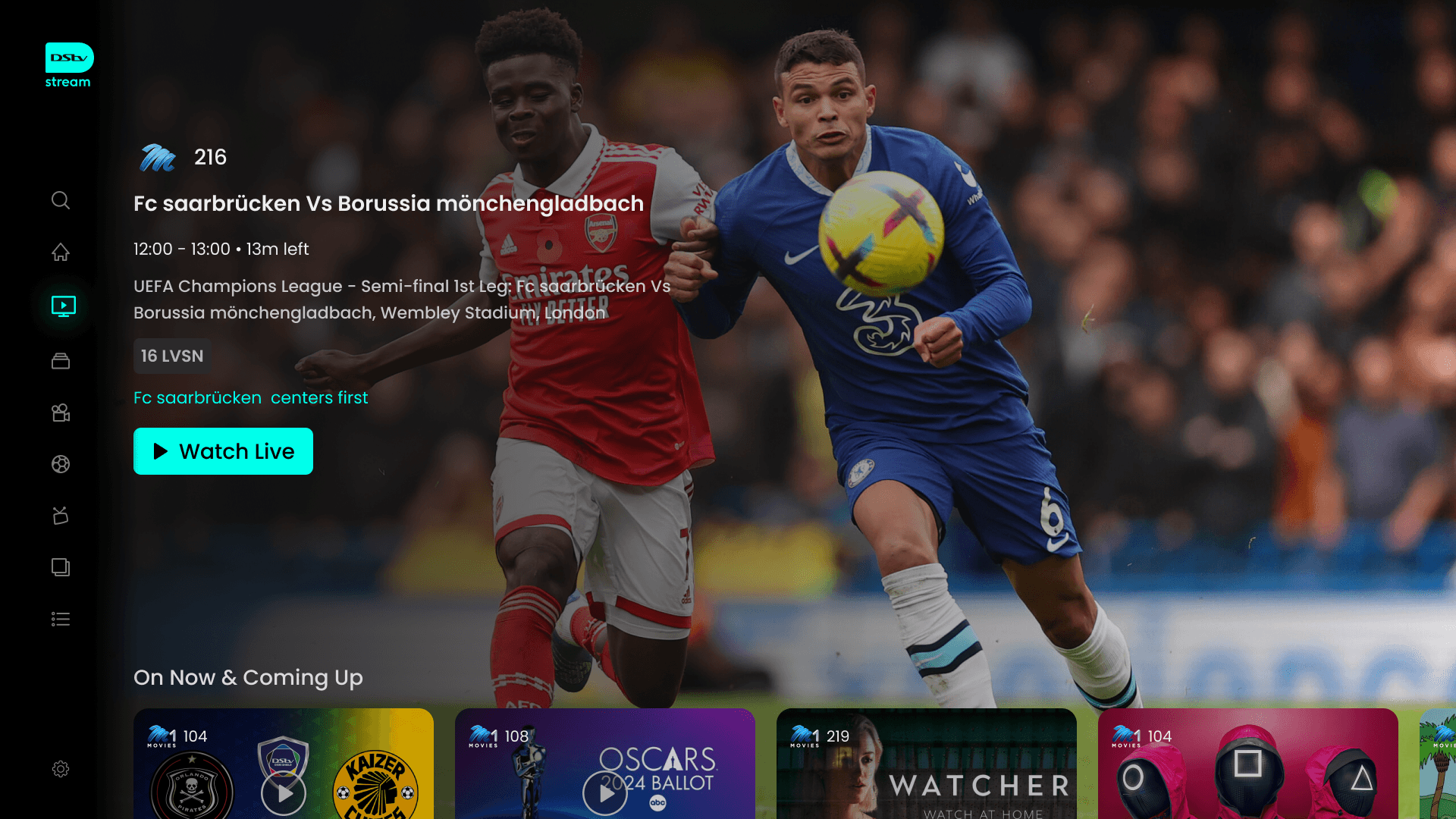
Live Sports
Dedicated hub with clear entry point.
Live matches prioritized for instant access.
Upcoming schedule + tournament view for planning.
Highlights & replays extend engagement.
Unique advantage with SuperSport integration.

Search
Smarter categories: genres, popular, “for you.”
Reduces friction vs traditional keyboard input.
Improves discovery for both casual and advanced users.
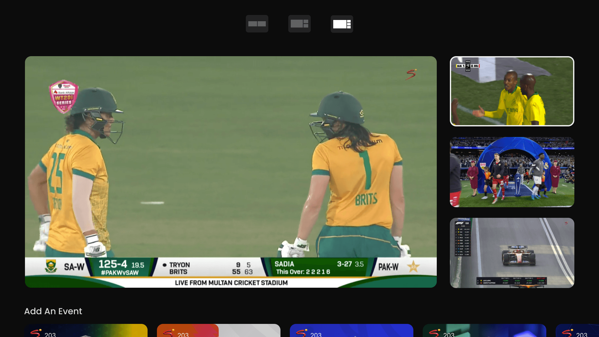
Multi-Channel Viewing
Watch multiple matches/channels at once.
Essential for tournaments and big events.
Differentiator vs global OTT players.
Personal Learning & Reflection
Working on the DStv Stream redesign was both challenging and rewarding. As part of the core design team, I had the opportunity to reimagine an OTT platform for TV screens at scale, balancing global OTT benchmarks with the unique needs of South African audiences.
Key Learnings
Designing for TV/Remote Navigation
Learned to simplify interactions for the 10-foot experience, where every extra click impacts usability.
Balancing Live & On-Demand
Understood the complexity of merging linear broadcast TV with OTT-style VOD in a seamless experience.
Personalisation at Scale
Recognized the importance of tailoring recommendations to diverse audiences while keeping the interface inclusive and simple.
Design System Thinking
Gained experience in building scalable, reusable components that ensure consistency across different devices and contexts.
Cross-Team Collaboration
Collaborated with product managers, developers, and content teams, strengthening my ability to communicate design intent effectively.
Reflection
This project deepened my understanding of how cultural context, content variety, and accessibility play a critical role in OTT design. It also reinforced my belief that good design isn’t just about aesthetics, but about reducing friction, amplifying unique strengths, and creating delight in everyday viewing experiences.