Revolutionizing Duplicate Invoice Management at Verida: UX Case Study

Overview
Verida is designed to address challenges in trade finance, particularly fraud detection and operational inefficiencies. Verida leverages advanced technologies such as blockchain and machine learning to provide real-time validation, authenticity checks, and secure document management.
Timeline
8 Weeks
Role
UX & UI Designer

Impact of Re-Design
Boosted duplicate invoice detection to
95%
Process
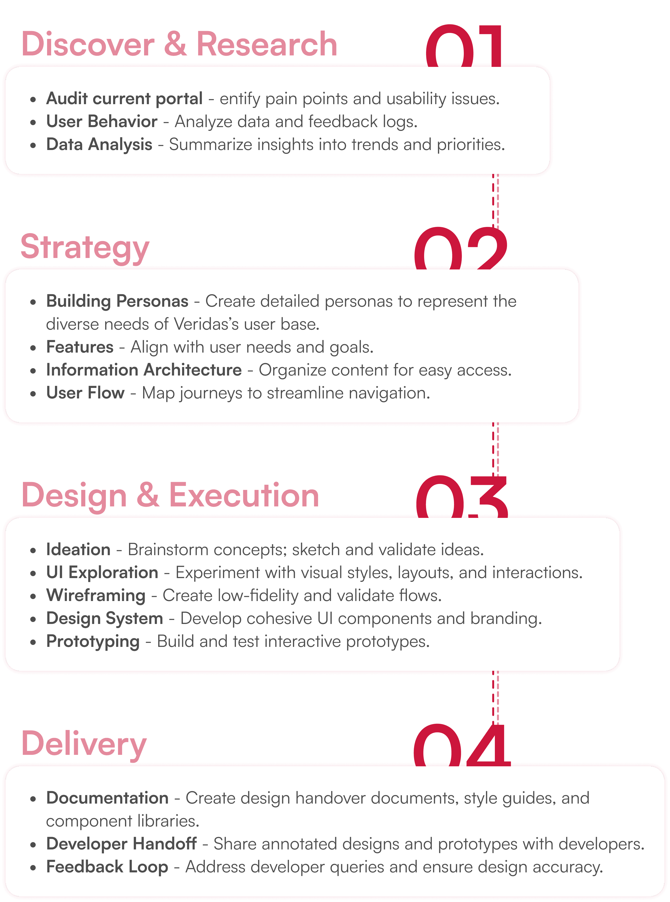
Client Concern
Why are the banking users not using the portal on regular basis?
What can we do more to increase onboarding of fintech/banking aggregators?
UX Audit Insights
Inconsistency and Absence of Standards
Lack of uniform design elements, creating a disjointed experience.
Ineffective Wayfinding Mechanisms
Unclear navigation tools, making it hard to find information.
Insufficient Visibility of System Status
Lack of feedback on system processes, leaving users uncertain.
Reliance on Recall over Recognition
Users must remember information instead of relying on visual cues.
Limited Baseline Familiarity and Intuitiveness
Assumes prior knowledge, making the portal less intuitive for new users.
Restricted User Control and Lack of Freedom
Limited customization options, reducing user flexibility.
Client Concern
Cluttered User Interface
Confusing flows and Information Architecture
Manual Invoice Duplicacy Detection
Problem Statement
Banking employees face significant challenges in managing duplicate invoices due to inefficient workflows. Confusing navigation, inconsistent terminology, and limited automation hinder duplicate detection, while inadequate feedback, cluttered data presentation, and restricted search options complicate the process, leading to errors and reduced efficiency.
Objectives
Enhance Navigation and Usability
Improve Data Presentation and Feedback
Streamline User Flows
Incorporate Robust Search and Filtering Options
Ensure Scalability and Customization
Goals
Increase User Efficiency
Improve Accuracy
Enhance User Satisfaction
Support Scalability
Drive Innovation
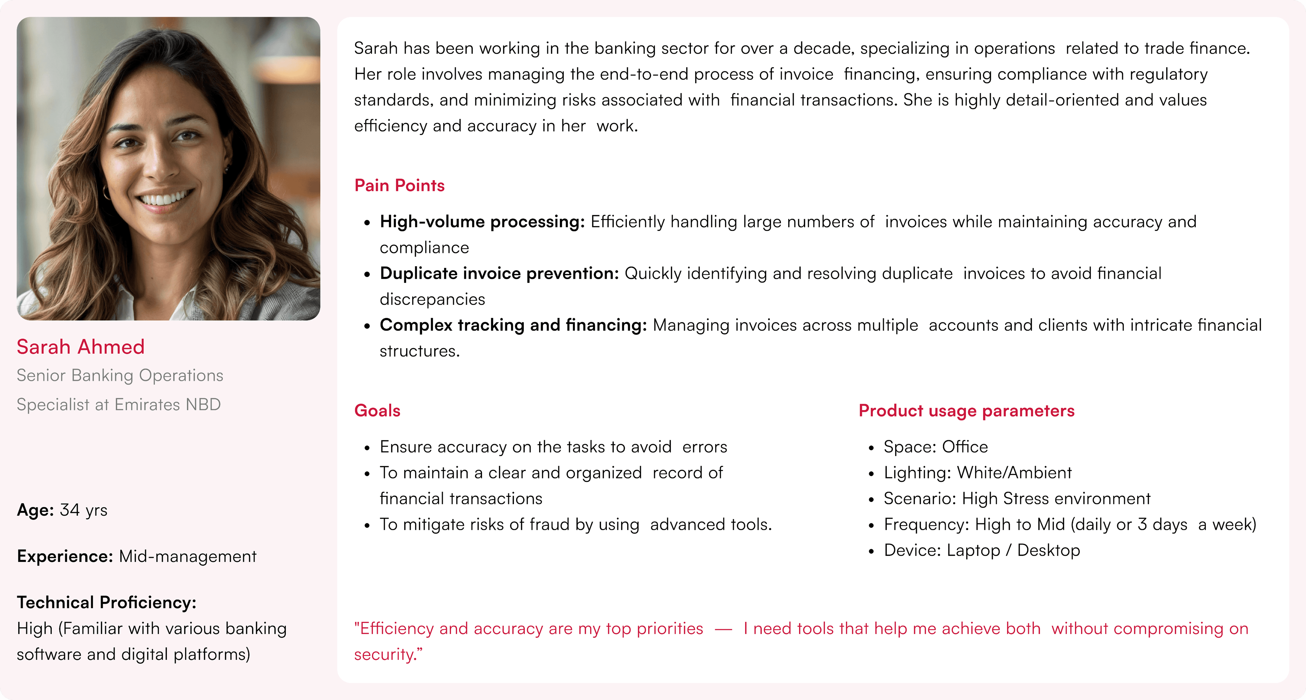
Persona
Improvised Information Architecture

Improvements
•
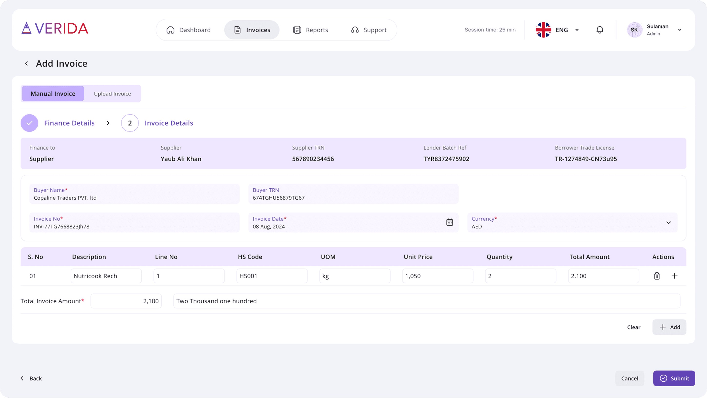
Revised the Invoice Uploading Process for a More Intuitive and User-Friendly Flow
•
Improved Navigation Across the Entire Portal
•
Introduction of a Support and Documentation Section
Improvised User Flows

Improvements
•
Enhanced the hierarchy and interactions of dashboard data points for improved usability.
•
Refined the reports navigation flow to ensure better user experience and easy of access.
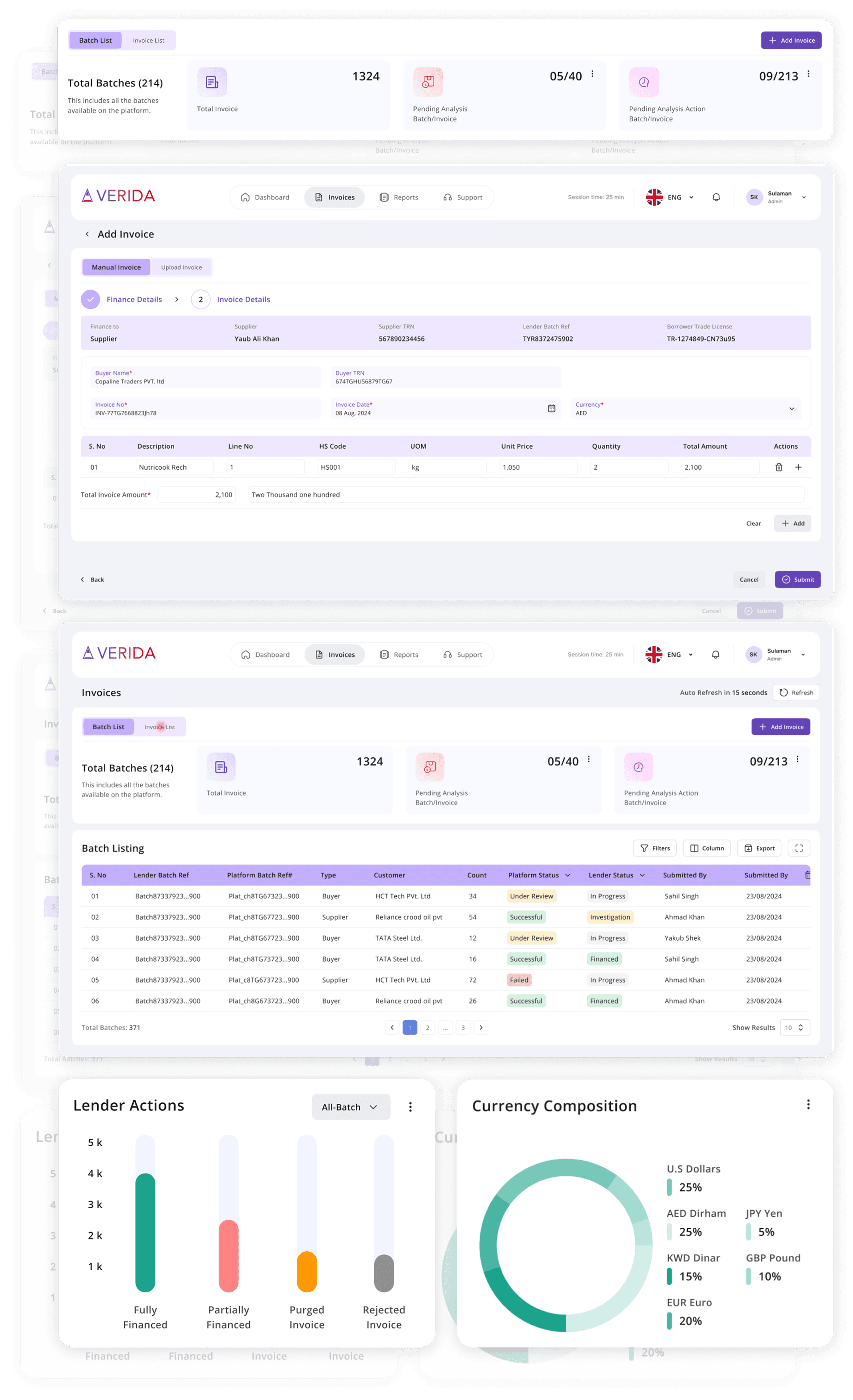
Enhanced Portal
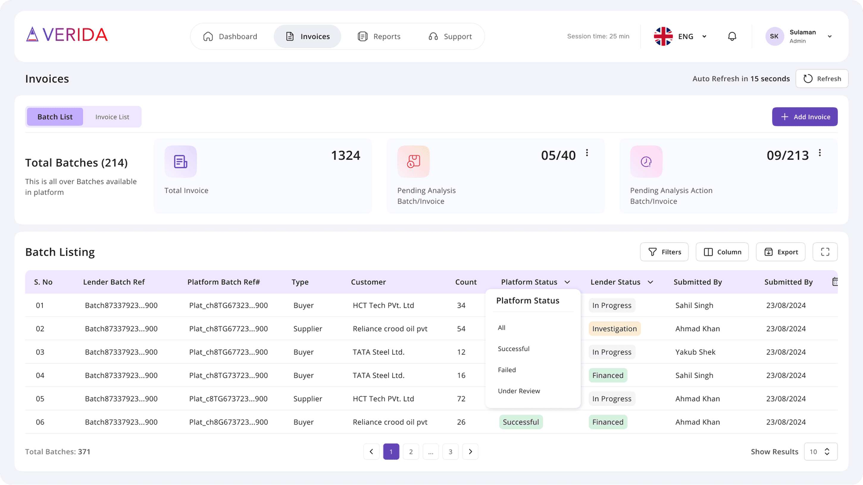
Table Interactions - Filters & Column Filter & Rearrange Columns
Implement interactive table features like customizable filters, column filters, and column rearrangement options, enabling users to personalize how they view and interact with data.
Impact: This improves UX by giving users control over their data presentation, enabling quicker access to relevant information, reducing time spent searching, and enhancing overall task efficiency.

User Feedback
Implement an easy-to-access feedback button, allowing users to quickly submit their issues.
Impact: This feature enhances UX by fostering open communication, allowing users to share feedback effortlessly, which can lead to timely improvements and increased user satisfaction.
Enhanced Visual Hierarchy
Use contrasting colors, larger fonts for headings, and strategically placed images to guide users’ attention to the most critical information first. Consider using whitespace effectively to avoid clutter and improve readability.
Impact: A stronger visual hierarchy will lead to better content digestion, allowing users to process information more efficiently and reducing bounce rates.

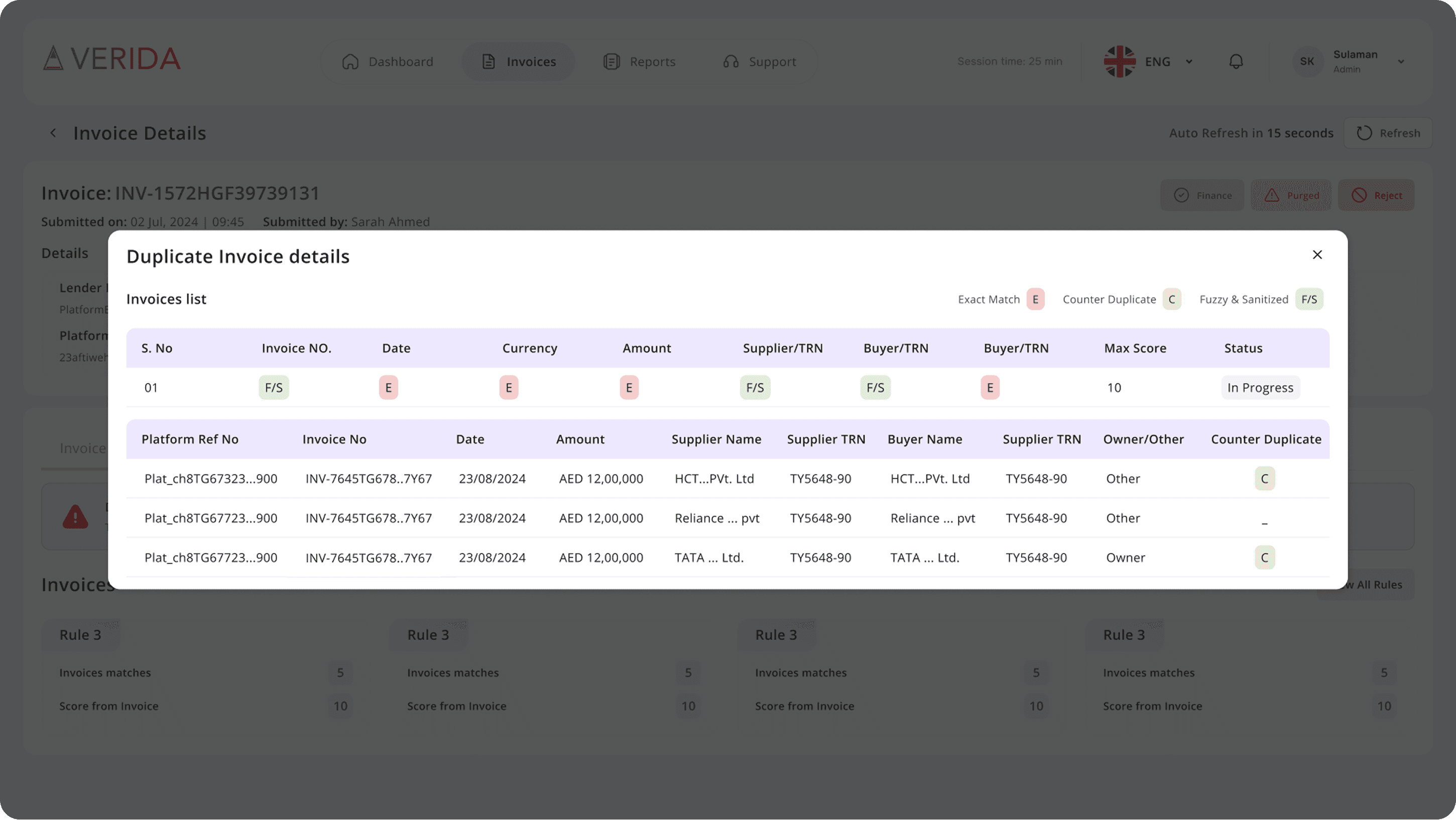
Automated Duplicate Invoice Detection
Introduce an automated system to detect duplicate invoices based on pre-defined criteria like invoice number, vendor, or amount, with alerts to notify users of potential duplicates.
Impact: This feature improves UX by reducing errors and time spent manually reviewing invoices, increasing reliability and accuracy in the process. It ensures that users can trust the system to flag inconsistencies, which enhances workflow efficiency and minimizes the risk of costly mistakes.
Clear Categorization of Content
Group related sections under broader categories.
Impact: This will reduce cognitive load by presenting information in a more logical structure, making it easier for users to find what they need quickly.

Auto Saving for Entered Data
Introduce an auto-save feature to ensure that all data entered is automatically preserved, even in cases of internet connection loss or other technical issues, thereby preventing any potential loss of information.
Impact: An auto-save feature enhances UX by preventing data loss, ensuring that users can continue their work uninterrupted even if a connection issue occurs, thus fostering a smoother and more reliable experience.
Customizable Dashboard
Provide users with a customizable dashboard where they can choose widgets, arrange them as per their preference, and filter the data they want to see.
Impact: A customizable dashboard empowers users to tailor the interface to their specific needs, providing a more personalized experience, improving task flow, and increasing user satisfaction by allowing them to focus on the most relevant information.


Task Flow
Simplify task flows by reducing unnecessary steps and ensuring logical progression through tasks. Incorporate visual cues and step-by-step guides to assist users in completing tasks smoothly.
Impact: A stronger visual hierarchy will lead to better content digestion, allowing users to process information more efficiently and reducing bounce rates.
First Time User Experience
The first-time user experience will include a brief onboarding tutorial that guides users through the portal, familiarizing them with its key features.
Impact: This onboarding process improves UX by providing users with a clear understanding of the portal's functionality from the start, reducing confusion and helping them navigate the platform with confidence.

Personal Reflections and Learnings
Building Trust, Optimizing Workflows, and Future-Proofing Banking UX Through User-Centric Solutions
Aligning Business Goals with User Needs
Balancing business objectives with user expectations was a key challenge. Through extensive research, I identified opportunities where UX could drive engagement and retention while also meeting compliance and operational requirements. The design solutions aimed to not only enhance usability but also contribute to customer acquisition and loyalty.
Optimizing Workflows for Efficiency
Financial transactions can be complex, but streamlining processes through UX improvements significantly enhances user satisfaction. By reducing cognitive load, simplifying multi-step verifications, and integrating clear feedback mechanisms, I ensured that banking interactions were frictionless and efficient for users.
